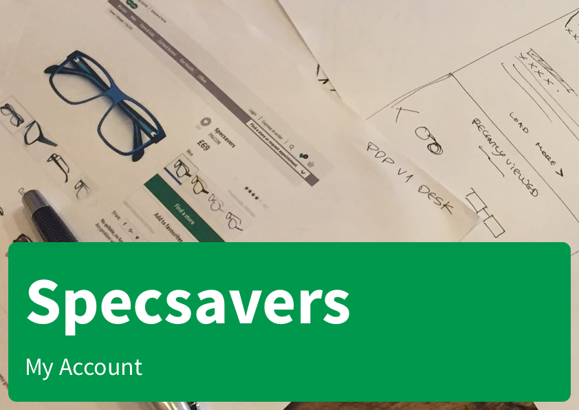
Specsavers
Eye health on every platform
Specsavers
Eye health on every platform
The purchase cycle
Selling online common items like books allows for well known customization techniques like offering related titles just a few days. Buying a book today, makes customers more likely to buy a book within a few days or weeks.
For glasses, however, the cycle is totally different. The whole buying process might last around 10 days and once the purchase is done, the brand might not hear about the user for 12 months for an eye test and even 24 for a new purchase.
My Account
With this premise, the approach for creating an user account relied on identifying where in the purchase cycle the user was at any moment. By going back to the user journeys that were mapped, we were able to track the user's activity online and offline, in the physical store, to provide just the needed information at any point in the journey.

Info Cards
With this in mind we designed a system of cards intended to provide just the key information relevant to every point in the process with the relevant calls to action that might be needed in each one.


Responsive Design
This system was implemented into an account design that could be integrated with the existing design while working in mobile and desktop versions.


Selected Works

Money and Pensions Service (2020)UX and Service Design
Sky (2019)Product Design

Cluster Seven (2018)UX and Product Design
Ubuntu (2016)OS Design
Specsavers (2016)Ecommerce
Caplin (2015)UX and Product Design
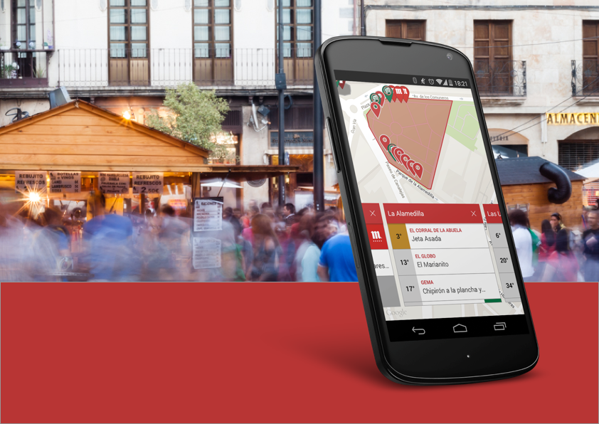
De Pinchos (2014)Product Design
Designed by Raúl Álvarez and built with the help of WordPress and Semplice.