Money and Pensions Service
Design to enable the development of an Adobe Experience Manager (AEM) CMS.
Money and Pensions Service
Design to enable the development of an Adobe Experience Manager (AEM) CMS.
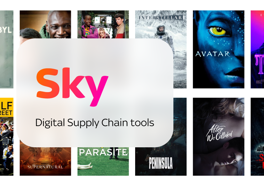
Sky
Systematic Design for a Digital Supply Chain
The Money and Pensions service is an office depending on the Governmet of UK with the goal of providing fair and unbiased information regarding money pensions and savings.
It is created to merge the duties of three current services: Pension Wise, The Pensions Advisory Service, and the Money Advice Service. The goal is to provide a single service with a holisitc approach to give financial advice through different life events such as buying a house, having a baby or getting divorced.
Sky is a leading telecommunications and television company in the United Kingdom. The core of their TV business revolves around making the most efficient use of the Intelectual Properties that they have licensed. The Digital Supply Chain is the set of internal operations that takes these IPs from the Metadata and Rights Management, going through Planning, Scheduling and Categorizing both Linear TV and Video on Demand, up until the Merchandising and Distribution of that content.

The project
As a result of this restructuring, NTT Data was comisioned with deploying a new Content Management System with the technology provided by the Adobe Experience Manager. I was the designer for this team which was in charge of delivering a running platform, a set of components and a set user profiles and workfows that would facilitate the editing preexisting content and new.
The challenge
In this context, the biggest challenge was to provide a functioning platform with a flexible set of components that enabled development, while leaving flexibility to be updated as the new brand or the UX of the site gets developed and validated in the future. Our aim was to provide a good scaffolding so they can create a great building.
Discovery phase
We worked on user journey mapping to prioritize the key elements needed to set the correct scope for the work of the developers. Although the final sitemap would be covering a hierarchy for thousands of articles spread over sixty menu entries in up to 3 level menus, functionally we were able to narrow all those down to 8 page types. By taking advantage of the component system that AEM provides, we were reduced the development to just three types of pages: a Home Page can be customized to provide highlighted links to selected content, a Content Page that adapts to all the other content types by packaging different groups of components in several templates, and a specific Search Results Page

Wireframing
After these analysis we started wireframing the structure for the two main templates that MaPS would need. We tried to show the flexibility of this component system so we could get stakeholders on board with the proposal while laying out the foundations so the developers could start planning the implementation.
Home Page
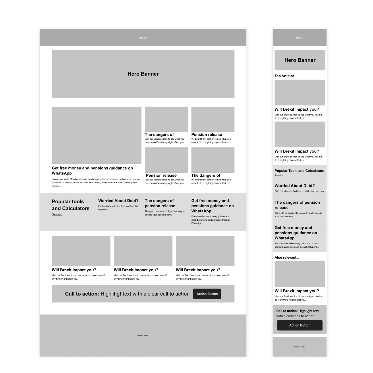
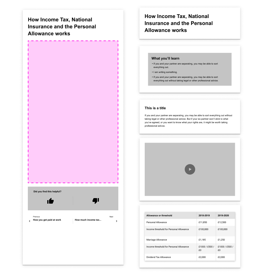
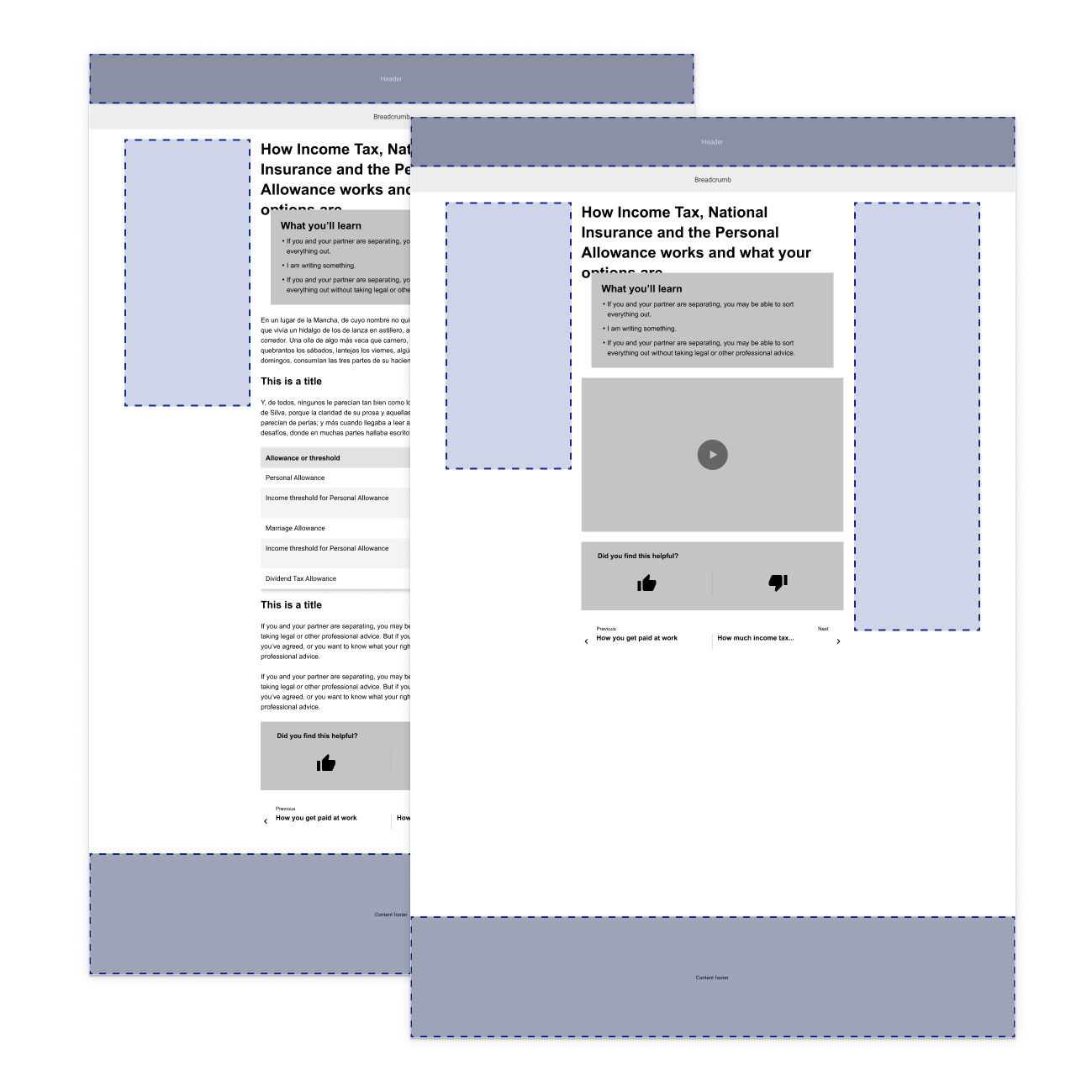
Content Page
Design Execution
Once the direction was agreed, the Design work was focused around executing a temporary design that could be implemented by the NTT Data developers, while making it easy to update once the final brand design was signed off. This required building a system that started with the most basic elements, such as typoraphy and color. From there, we designed and provided specifications to the basic components, such as buttons or input boxes. Once this was ready, we were able to start providing designs for more complex elements such as the global navigations or the financial calculators that required a more 'ad hoc' design and implementation.
Typography and Color palette
Typography and Color palette

Grids

Basic Components Specs

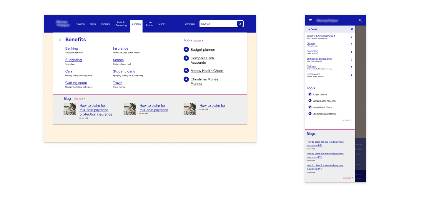
Global Navigation
Baby Costs Calculator
One of the key elements of the old and new websites was a set of up to sixty financial calculators, covering everything from mortgages to pensions. As part of the scope of this project we designed and implemented the most popular one, the Baby Costs Calculator. Through the design of the user flows we could get the behavior always with reusability in mind so the new calculators could be built with the same system in the future.


The Results
This was a challenging project that required a very tactical aproach to design. With the final Brand Design as our biggest bottle neck, we had to maneouver around it to make sure that the project could be delivered in budget while making sure that the system we left behind covered the needs of the editors, first, and eventually the users.
Enable Development
By providing a temporary design, priming on the structure rather than on its final look we were able to put the new CMS in place, leaving the editors and developers of MaPS with a tool that they can use and extend to cover for future needs.
Structure and Flexibility
The resulting product provided enough flexibility to adapt for the future while relying on a solid structure that made more efficient and effective the design and development of these future capabilities.
Design Consistency
By applying this systematic approach and taking advantage of tools like Figma, we generated a palette of components over repeatable patterns.
This also had an impact in facilitating the work of other designers when working on concepts to extend this tool to other areas of the Supply Chain.
Editors and Designers Tool
The focus of this design was not so much on the final users of the website. It was about providing content editors and designers with the right tool to make sure the website will fulfill the user's need when all the pieces are in place.
Development Handover
Since the design was component oriented, the work produced by the developers was also of a higher quality.
They could generate an equivalent library, translating the components from Figma to React. With this we ensured that they were looking at the modules and panels to build the different views, allowing higher reusability than just focusing on implementing the features of every screen.
Selected Works

Money and Pensions Service (2020)UX and Service Design
Sky (2019)Product Design

Cluster Seven (2018)UX and Product Design
Ubuntu (2016)OS Design
Specsavers (2016)Ecommerce
Caplin (2015)UX and Product Design
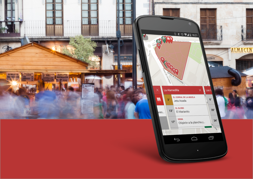
De Pinchos (2014)Product Design
Designed by Raúl Álvarez and built with the help of WordPress and Semplice.